San Francisco Crime Map
October 2003
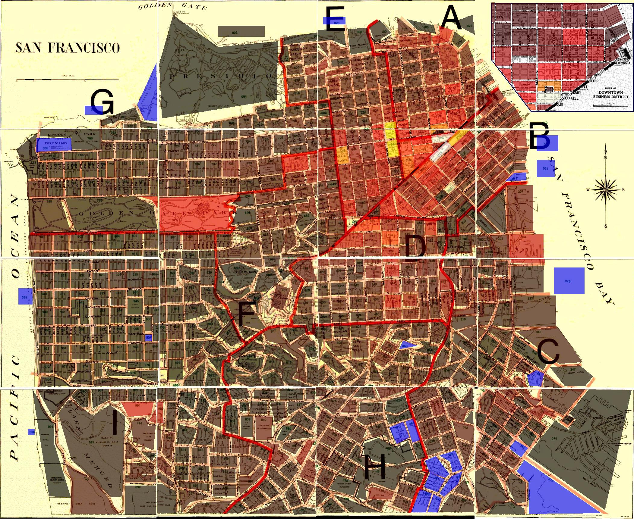
Jennifer and I were thinking of buying a house in a neighborhood known as Silver Terrace, which we hadn’t heard anything about, so we asked about it on Craigslist and most of the replies warned us that crime there was high. So Jen found the part of the SFPD website (now gone) that had interactive maps that told you the crime rate as of October 2003. It’s difficult to compare various areas, though. You have to click on a high-level city map, which takes you to a low-level map, where you can click on a plot, which takes you to a text page with various crime statistics.
So I wrote a program using Python and the Python Imaging Library that parses the HTML and creates a map with crime highlights.


A few interesting things:
- The Bayview and Hunter’s Point areas, notorious for crime, aren’t really much worse than anywhere else.
- For five years Jen lived in the plot immediately north of the two bright yellow blocks. Silver Terrace (at the intersection of the lower-right four blocks) looks mild in comparison.
- Don’t leave your car in Golden Gate Park.
- The color represents the number of crimes, but really it should represent the number of crimes per unit area, since some plots are much larger than others. For example, just below the two bright yellow plots are two smaller plots that are suspiciously dark. It’s probably because they’re smaller that their numbers are lower in absolute terms. I tried to do this but it failed pretty badly because I don’t have the actual plot area, only the area as it was in the clickable map of the original web page. Plots that are on the edges of tiles are far too small, since they’re clipped off. That was throwing everything off, so I went back to absolute numbers.
I also had the various breakdown data (violent crime, burglaries, etc.) but I didn’t think it was useful to display it. It’s probably fairly proportional all around. It would be cool to see this over time, say over 30 years. We could also plot the exact locations of registered sex offenders (Megan’s Law), etc. If anyone knows where I can find more raw data, please let me know. It’d make a useful applet.
(Technical notes: The original website broke the city in 16 sub-maps, hence the seams. The thick red lines are district lines. The plot contours were taken from the clickable maps’ <area> tags, some of which were of type RECT and some were POLY.)