Gamma Correction in Computer Graphics
February 13, 2003
Introduction
The term gamma correction means doing graphics color math accounting for the distortion that the color will eventually go through when displayed on a monitor.
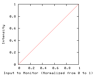
Phosphors of monitors don’t react linearly with the intensity of the electron beam. If they did, a linear input ramp would result in linear light intensity:
Instead, the input value is effectively raised to an exponent called gamma. This gamma value is normally around 2.2 for NTSC monitors and computer displays. This has the effect of darkening output light:
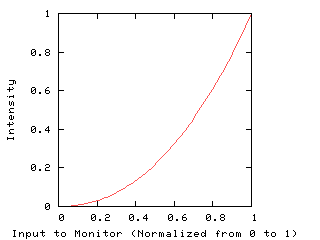
Notice that 0 stays black and 1 stays white, but the in-betweens get darkened. This curve gets applied to each of the primaries (red, green, and blue) individually, so throughout this paper I’ll talk about color but I really mean intensity. Hue and saturation aren’t really affected. It’s actually easiest to think of this for shades of gray.
I’m not sure if phosphors are this way naturally or if they were designed on purpose, but it’s convenient that they behave this way because the eye’s sensitivity is effectively inverse to this. The eye is more sensitive to changes in dark shades than in bright shades: you’re much more likely to notice a difference between 10% and 20% intensity than between 80% and 90% intensity. The eye sees relative differences. This technically makes it a log scale, not a gamma scale, but the actual curve of the eye’s sensitivity isn’t important to us. We just need to know that it’s more sensitive to darks.
This extra sensitivity to darks means that if monitors generated linear intensities (the first curve above), there would effectively be less resolution in the darks. Any noise or quantization would be much more noticeable in the dark areas. In computer graphics we often use 8-bit values, and a perceptually-linear ramp of 256 different shades of gray will show noticeable stair-stepping in the dark regions.
So we’re glad that the phosphors have this curve, because by darkening our colors it lets us keep more resolution in the darks. For a gamma of 2.2, for example, light at 50% intensity is generated with an 8-bit value of 186. This gives us 186 shades of dark and 70 shades of bright. The reduced resolution in the bright areas isn’t noticed because the eye isn’t as sensitive there.
We need to take this distortion into account in our graphics math, however, or colors will end up too dark and things like anti-aliasing won’t have the effect we want.
Terms
I’ll use intensity to mean the amount of light coming out of the monitor. This can be measured with a light meter and is proportional to the number of photons or the amount of energy or however else you want to think of it.
The term brightness, though, is perceptual. It’s how you experience light. One shade could have twice the brightness as another, and that just means that you perceive it to be twice as bright. In reality the brighter color will have more than twice the intensity because of the eye’s non-linearity.
Gamma is the exponent on the input to the monitor that distorts it to make it darker. Since the input is normalized to be between 0 and 1, a positive exponent will make the output lower. I believe that NTSC specifies a gamma of 2.2 and the new HDTV standard specifies 2.5.
The Pipeline
Let’s say we’re drawing an anti-aliased polygon. The principles are the same when doing image processing or any kind of blending, but it’ll be easier to demonstrate this with drawings.
We’ve got a polygon edge that covers half a pixel. This is a polygon scan converter that figures this out analytically, not with over-sampling. The background is white and our polygon is black. We want to simulate a white pixel that we’ve covered up half of with a black cardboard sheet. This will give us half the light, half the intensity:
![]()
The scan converter knows that the background is 255, that the polygon is 0 (black), and that the coverage for this pixel is 50%. It calculates a new pixel value of C and sticks it into the frame buffer. This value is converted by the DAC (digital to analog converter) into a voltage, which is passed on to the monitor. We assume that the DAC works linearly. The monitor’s phosphor raises this value to its gamma, say 2.2, and outputs light. The eye perceives the light non-linearly, using a curve which is roughly the inverse of a gamma of 2.2.
Now notice that we don’t really care what the eye does. We’re trying to simulate a cardboard sheet over half the pixel, blocking half the light. As long as our monitor’s pixel actually outputs half as much light as full white, it will look right to the eye. The eye’s non-linear sensitivity is only important if you want, say, a gray ramp that “looks” linear. We’ll talk about that later, but for most of this essay just think about reproducing a specific intensity, not any specific brightness.
The Wrong Thing To Do
Most graphics systems I’ve seen simply calculate C as a weighted average of 0 and 255, producing 128. This goes through the linear DAC, producing a voltage half-way between black and white, and the phosphors produce a light at about 22% intensity. This is much too dark for our pixel that’s supposed to be half-covered, and as a result our anti-aliasing looks bad and jagged.
One Solution
A solution that Silicon Graphics machines have used for a while is to have the DAC generate voltages non-linearly. There’s a command called “gamma” on SGIs that many people use to brighten their displays. If you set it to 2.2, you’re causing our 128 value to get sent to the monitor as 73% of full voltage, and that generates a light intensity of 50%.
The great advantage of this scheme is that the graphics math stays simple and intuitive. A 50%-covered pixel has a color value halfway between the foreground and the background. Lighting, blending, and anti-aliasing stay linear.
The disadvantage is that you’re using half your 256-value range for darks and half for whites, but that’s wasteful for whites (the eye can’t resolve that many shades between 50% intensity and white), and not enough in the darks. For many systems that’s not a problem, but if you’re going to have images that have lots of dark areas, you’ll see banding.
Note that if your frame buffer had more than 8 bits, say 16 bits per component, then this scheme would be perfect. That’s a few years away and hopefully after that I can delete this page and never hear of gamma again.
Another Solution
Meanwhile, though, we have to put up with 8-bit frame buffers and subtle dark areas, so simply cranking up the output of the DAC won’t work. We need to make better use of our 8-bit values, and that means thinking of them as being in gamma space, as opposed to linear space. The latter is linear with intensity, the former assumes that it will go through a gamma curve first.
In this gamma space, 0 is black, 255 is white, and 186 is 50% intensity. Whenever doing any math on colors that are being blended, convert the colors to a linear space, do the math, and convert the result back. Conversion is done by raising the values to the power of 2.2 or 1/2.2, respectively. You want to keep the intermediate results in a higher number of bits, such as 16-bit fixed or 32-bit float, so that you don’t ruin your darks in the process. I’ve used 16-bit values because you can generate look-up tables to quickly convert back and forth.
In our example, 0 and 255 are both first converted to linear space. This gives us 0 and 65535, since black and white aren’t affected by gamma. We average, giving us 32768, and raise the result to 1/2.2 to get 186.
This has the advantage of looking nice and having good resolution in the darks, but the significant disadvantage that all math must be fixed. For example, after you light a vertex or a pixel, the lighting result must be raised to the power of 1/2.2 before being saved into the frame buffer. You should also fix any interpolation, such as Gouraud, although in practice I doubt it’s a problem for small polygons.
When I worked at Pacific Data Images (PDI) a few years ago, we realized that we’d been doing it all wrong and fixed all of our code to be gamma-correct. Suddenly all sorts of problems that we’d been having for almost 20 years went away! It was a lot of work, but our images looked significantly better.
Implementation
You can generate your tables like this:
    static const float GAMMA = 2.2;
    static unsigned short gamma_to_linear[256];
    static unsigned char linear_to_gamma[65536];
    int result;

    for (int i = 0; i < 256; i++) {
        result = (int)(pow(i/255.0, GAMMA)*65535.0 + 0.5);
        gamma_to_linear[i] = (unsigned short)result;
    }

    for (int i = 0; i < 65536; i++) {
        result = (int)(pow(i/65535.0, 1/GAMMA)*255.0 + 0.5);
        linear_to_gamma[i] = (unsigned char)result;
    }
If you look at the linear-to-gamma table, you’ll notice that you can’t get a result of 1. Despite the 16-bit resolution of the linear encoding, it still has less precision in the very dark areas than the 8-bit gamma encoding. At PDI we figured that if we were going to lose one value anyway, that we should go ahead and use a linear space that goes from 0 to 32768. That allows us to use a shift instead of a divide for many common operations:
    result = linear_to_gamma[
            (gamma_to_linear[fg]*alpha +
             gamma_to_linear[bg]*(32768 - alpha)) / 32768];
Had we used the full 16-range, we would have had to divide by 65535, which can’t be optimized as a shift. Here’s the code to generate these tables:
    static const float GAMMA = 2.2;
    static unsigned short gamma_to_linear[256];
    static unsigned char linear_to_gamma[32769];
    int result;

    for (int i = 0; i < 256; i++) {
        result = (int)(pow(i/255.0, GAMMA)*32768.0 + 0.5);
        gamma_to_linear[i] = (unsigned short)result;
    }

    for (int i = 0; i < 32769; i++) {
        result = (int)(pow(i/32768.0, 1/GAMMA)*255.0 + 0.5);
        linear_to_gamma[i] = (unsigned char)result;
    }
(Of course we used constants for all these numbers and did bounds checking when looking up into arrays. I’m simplifying the code so that it’s easier to understand.)
Note that the “alpha” value in the code sample above is also in the 0-32768 range, but it's converted linearly from 0-255. We had a separate pair of arrays that did a straight map.
Brightness
Earlier I said to ignore what the eye does and just concentrate on getting the right intensity. Sometimes you want a perceptually-linear ramp, though. This is particularly easy with this scheme, because you only need to draw a ramp that’s linear in gamma space.
Results
There’s an image of a filled-in polygon at a steep angle, using no anti-aliasing at all:

Here’s straight anti-aliasing with no regard to gamma issues:

And here it is with the gray values gamma-adjusted so that the anti-aliasing looks correct:

The last image looks slightly better to me on my laptop. Whether the second or third image looks better to you will depend on your setup. This is especially true if you’re on an SGI machine and you’ve got your gamma turned up, in which case the second image will look better. Most people, though, have their monitors set so that the third image will look better.
At PDI for years the people who did compositing were taught that after blurring an image, you had to brighten it up a bit. This wasn’t necessary after the gamma fixes. Previously the blurred images were too dark because averaging gamma-encoded values produces a value which is too low. This gets worse as the differences between values grows. So a high-frequency black and white checkerboard looks bad no matter what you do to it unless you treat the gamma-encoded values correctly.
We were also surprised to find that we had been converting color images to black and white incorrectly. The blending formula (30% red, 59% green, 11% blue) must be done in linear space. The black and white images that were correctly generated looked much more like the color had been drained out of the original image. The incorrect ones looked like they lost color and got darker. The left image below is done incorrectly and the one on the right takes into account gamma:

Miscellaneous
While we were figuring all this out at PDI some people wondered whether we now had to convert all our exising pictures to gamma space. But in fact the pictures had been in gamma space all along! Just the fact that you’ve got a color that you put through this phosphor distortion means that, by definition, the color is in gamma space.
Joel Spolsky once wrote an article about ClearType and how anti-aliased text isn’t as readable as aliased text because it looks blurry. That’s true for very small fonts, such as those below 12 points, but I’ve displayed 24-point gamma-corrected anti-aliased text on a 640x480 monitor that made people think it was a high-definition display. Anti-aliased text without gamma correction may indeed look worse than no anti-aliasing at all.
You can guess the gamma of your monitor by squinting and finding the shade on the right that roughly matches up with the one-pixel checkerboard on the left:
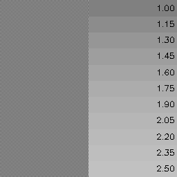
I just ran through various gamma values and put 50% intensity through it to get a pixel value. This isn’t a very good way to do it, since a one-pixel checkerboard won’t give off exactly 50% intensity on average, but it’s a decent first approximation. Finding a match above is particularly hard on my laptop, where the ramp on the right looks bluish.
If you’re serious about getting colors right you should invest in a light meter and graph what it says as you fill the screen with the each of the colors on the right above. One of them should get close to 50% intensity. You may also find that each of the color primaries don’t have the exact same gamma.