Don’t Use Checkboxes
Avoid checkboxes in user interfaces. Use radio buttons instead. Checkboxes have one advantage over radio buttons: they take up less space. But they have a serious flaw: it’s often not clear what it means for the checkbox to be unchecked.
Here are a few examples. The first is from Quicken WillMaker’s Preferences window:
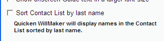
It’s clear that if the box is checked, the contact list will be sorted by last name. How will it be sorted if it’s not checked? They obviously found that users had trouble with this item because they added an in-line help paragraph, but the paragraph is only rephrasing the checkbox label. Better to redesign with radio buttons:
Order it by last name.
Note that I’ve replaced “sort” with “order”, which is less technical. Also note that I have no idea what the unchecked sort order is, so I’m guessing that it’s by first name.
The second example is from MediaWiki, the software that runs Wikipedia. When setting preferences, you’re shown this option for the formatting of broken links:
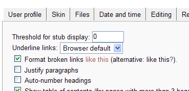
Here they recognized that the unchecked state was unclear, so they wrote it in the text of the checkbox. It would have been more straightforward to use radio buttons:
Like this?
Or perhaps more explicitly:
Followed by a red question mark?
(I think I prefer the first option.)
The third example comes from TortoiseSVN, an excellent Windows program for using the Subversion source code control system. In their preferences window they present you with this checkbox:
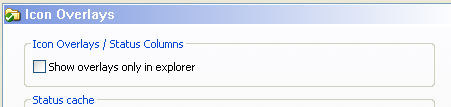
Presumably if this is unchecked then overlays (the little icons that show the status of files) are shown everywhere, but if you check this box then you’ll only get them in Explorer. I had to Google the phrase “show overlays only in explorer” to discover that “everywhere” means Open and Save dialog boxes. We can save the user this trouble by using radio buttons:
Only in Explorer.
For fourth example is from the Chrome web browser, which lets websites send push notifications to your desktop. In the Chrome settings there’s this checkbox to control how this works:

If it’s enabled, Chrome will ask you before sending you push notifications from a website. What if it’s off? You might think that websites will be able to send you push notifications without your approval, but instead all notifications will be blocked. It’s more clear to use radio buttons:
Ask me for permission (recommended).
This also lets you add an “Always allow” option, though I doubt anyone wants that!
The final example comes from the preferences page of Zimbra, a Web-based mail and calendar suite:
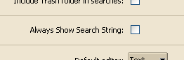
There’s no context around this checkbox, it’s just sitting there by itself. It’s pretty hard to guess what this checkbox could even mean. I looked in the help and it said, “To always show the search string in the Search text box, check Always Show Search String. When this is enabled, the search text box displays the search query that produced the list of items that display in the Content Pane.” This explanation clarifies what happens when you check it, but still leaves out what happens when it’s unchecked. What’s displayed in the Search text box? Nothing? I tried a search with the checkbox unchecked and the search string did remain in the text box. So I can’t guess what difference it would make to check it, and therefore can’t even suggest a radio button redesign.
Google seems to have moved away from checkboxes. In Gmail’s Settings page they avoid checkboxes altogether:

Anyone else would have used a checkbox with the label, “Use UTF-8 for outgoing messages.” Google even uses radio buttons where a checkbox would be fairly clear:
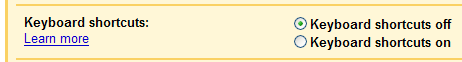
I think this is good, not only for consistency, but I think it’s still more clear and explicit than a checkbox. Here’s an even plainer example from Google Calendar:
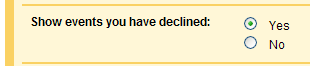
That example is a borderline checkbox. I would have preferred a more explicit phrasing:
Hide them.
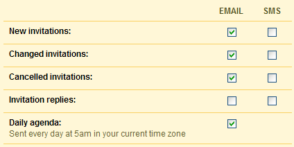
So when are checkboxes acceptable? I just went through the Options dialog boxes of several large applications and couldn’t find any good uses. In each case there was at least a little uncertainty in my mind as to what would happen with it unchecked. They could all be improved with a radio button redesign. Perhaps checkboxes are useful in tables, like this example from Google Calendar:
Update January 5, 2009: Daniel Oskarsson correctly points out that I missed a great use for checkboxes: When more than one answer (or none) may apply. His example is:
C++
C#
Java
PHP
Cobol
Scala