Memoir book
July 17, 2017
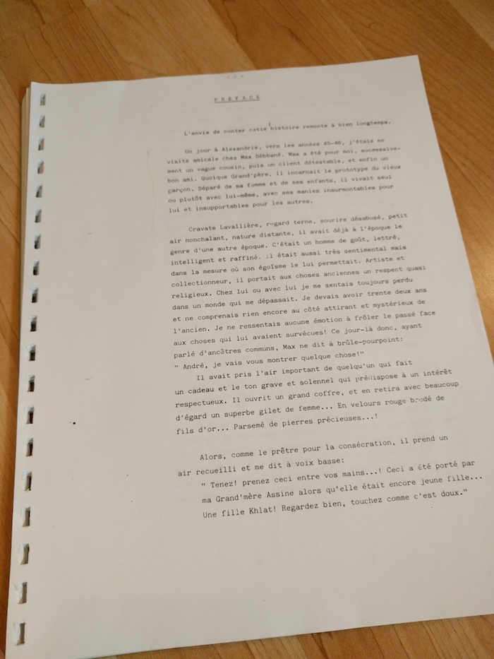
In the 1980s, my great-uncle, André Klat, wrote his memoirs on a typewriter. The memoirs included the family history going back to 1760 and charming stories of his youth and adulthood in Egypt. The copy that made its way into my hands had been photocopied so many times that some pages were barely readable and some text had been clipped.
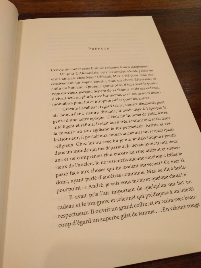
I decided to properly typeset and print the book as a gift to my family.
I had printed one-off books before using Lulu: my Graphics Engine book, typeset with LaTeX, and my Nutshell book, typeset with Prince from HTML source. For this book I wanted the typesetting to be top-notch, and neither of these systems pleased me. (Despite all the talk about TeX doing beautiful typesetting, I'd never particularly liked its output.).
Clearly, the only solution was to write a typesetting system from scratch. I'd always wanted to write one anyway.
I scanned all 236 typewritten pages to 18 PDF files and used Online OCR to convert them to a text file. (I had first tried Google Docs, which can convert a PDF to a document, but the results were poor.) The most time-consuming part of the project was proof-reading the book a few times to fix original misspellings and OCR errors. I added 465 index entries, 21 photos from the family's archives, and 84 footnotes to translate foreign language phrases or explain references to famous people of that era.
I then designed a Markdown-inspired markup language that handled just enough to do what I needed (italics, small caps, headers, page references, footnotes, images, index entries, and special sections). The system performs automatic hyphenation and properly handles kerning and ligatures. The interaction of the three is a fascinating problem! The program uses the TeX approach of boxes and glue, copying TeX quite closely in this respect. I'm thankful that Donald Knuth took the time to document TeX's algorithms so well. In fact I spent a lot of quality time with the TeX source code!
I'm pleased with the result:
TeX famously uses a global optimization algorithm to break paragraphs into lines (see Chapter 3 of Knuth's Digital Typography), but it doesn't use that algorithm to break the whole document into pages, which is a similar problem. The limited memory of the early 1980s was the main reason for this, but that's not a problem now! I used the algorithm for both. Using it for breaking pages made some things harder, like switching number of columns part-way through a page, inserting page breaks to odd pages, and positioning footnotes. But it allowed me to specify things like, “Prefer putting images on the same spread as their references,” and “Prefer not splitting footnotes.” For example, this portrait of Nicolas is on the same spread as the reference to him on the left page (“Celui du tableau”):
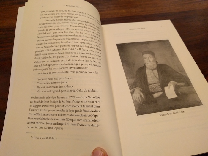
(That's my great-great-great-great uncle holding his will.)
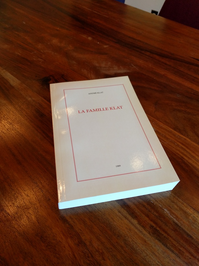
Although the book was written in the 1980s, many of the stories take place in 1920s francophone Egypt. I wanted the book to feel like an early 20th-century French book. I chose a classic-looking font (Minion Pro) and layout (things like placement of page numbers, layout of table of contents, positioning of photos) that matched French books of that period. The author's brother Edgard published a book of philosophy in 1969, and I designed this cover (using a Java program, of course!) so that the brothers could have similar-looking books side by side on the shelf.
In 1936 the author and his brother Edgard founded a furniture company in Alexandria called Ediar. Entire chapters of the book describe the growth and success of the company. In 1960 they fled Nasser-controlled Egypt for Lebanon, transferring management of the company to its accountant. The author never explained what subsequently happened to the company. Did it get nationalized? Did it just fold? I searched for the company online and found architect Nael Badr, who had worked at Ediar in 2012. I contacted him and found that the accountant was his grandfather, Elsayed Badr! Elsayed later bought the company from my uncle, but had to smuggle the payment out of Egypt in eight trips to Lebanon, with the cash sewn into his suit by his tailor. Elsayed died in 1993 and passed ownership to his two sons, who still run the company today. I'm indebted to Nael for his help reconstructing this story and for his photos of modern-day Ediar.
My favorite part of the project was obsessing over the typography. For example, in French there's a space before punctuation that's made of two parts (question marks, exclamation marks, colons, and semicolons). Normally people use a full space, but I had noticed that nicely-printed books used a half space. (Except after an ellipsis, where you want a full space to match the spaces between the dots.) It also pleased me to use the correct dashes everywhere, and to use a font that had real small caps. (That's in fact the main reason I chose Minion Pro.)
The source code is available on GitHub.